Changing your visual identity is never a simple step; it is certainly a meaningful and compelling moment to become even more aware of who you are in the present, where you started from and where you feel like continuing the path. But above all it is a deep reading of all those vibrations of which a brand is made - those values that evolve over time without getting lost – so that they can be expressed in shapes and colours, to reach with simplicity and immediacy even those who decide to choose a brand and take it to their homes ... on their tables.
This is the work that Scoiattolo has done on itself in the last year, to arrive on the shelves of fresh pasta in supermarkets in September 2025 with a new logo ... a soul and a story to tell, and in the meantime one it continues to write.
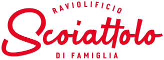
After more than 40 years, our Raviolificio Scoiattolo returns to its essence with a NEW LOGO, taking up elements capable of expressing it in the best possible way:
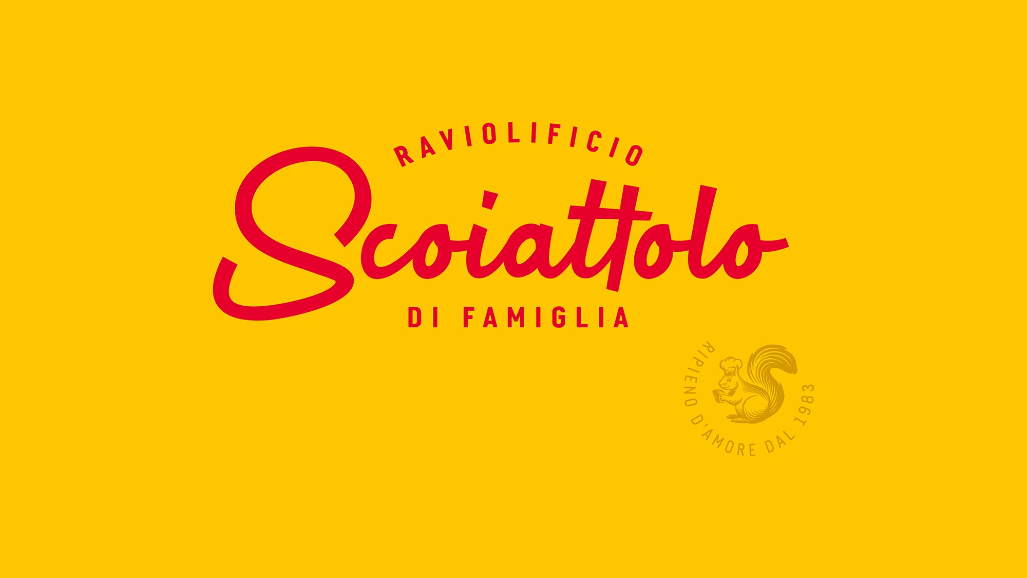
- the lettering of its name recalls the handmade drawing made by the founders at the beginning: lettering with the aroma of tradition, passion and truth. A simple and sincere redrafting with a renewed graphic design, as a tribute to those who began this adventure and to those who continue to carry this story forward with evolutionary tension every day.
- The dedicated "S", a strong and identifying element for the company, seeks to evoke the tail of a squirrel.
- The new "RAVIOLIFICIO DI FAMILIA" payoff makes it possible to fully represent ourselves: because yes, we are a company, but before that, we are a very specific place. Where new recipes, new aromas, new formats, fillings and ideas are born every day to be created, together, with care. And we are also a family, who have been lovingly believing in something great since 1983.
- The extra element: the stamp with a small squirrel, a character placed as a guarantee of this name as charming as it is unique, for a fresh pasta company, to represent goodness, curiosity and dedication and that accompanies every product and every word of the brand with love.
- The red colour for the logo, a direct reference to the company's historical colour, with a bold and bright new touch (albeit expressed with different colours within the new packaging); the vibrant yellow, used in communication: an intense and enveloping colour capable of recalling the wonder of fresh pasta and pastry that has always flowed "in the hands" of the brand.
All this, combined with our four new product lines, is our new way of expressing the Scoiattolo brand: true to who we are and ready to tell our story with an image that resembles us even more.
Welcome to our new look. Inside, there is always the taste of home and that of an experience to savour, experience and remember, together